Organizational Communication Works
Explore various organizational communication pieces that include websites, booklets, social media campaigns, and blog posts.
Pathways Program Booklet
The Pro Deo Foundation needed a written communication piece to share with potential supporters and investors. The main goal for this piece was to showcase the foundation’s new innovative youth program, Pathways Carpinteria.
The booklet needed to show the programming elements and goals and include the research, financials, and other pertinent information required to build a support case.
Pro Deo Foundation worked hard to develop a unique and innovative youth program. They needed a communication plan that reflected and communicated the value of this program.
Through innovation and strong communication
The Pro Deo Foundation successfully launched Pathways Carpinteria. The foundation experienced acceptance for its programming model which proved to be highly successful. The foundation developed partnerships withing
the Carpinteria Unified School District and the local community of Carpinteria which led to program growth and gave Pro Deo the chance to
meet its organizational goals of helping students find their place, passion, and purpose.
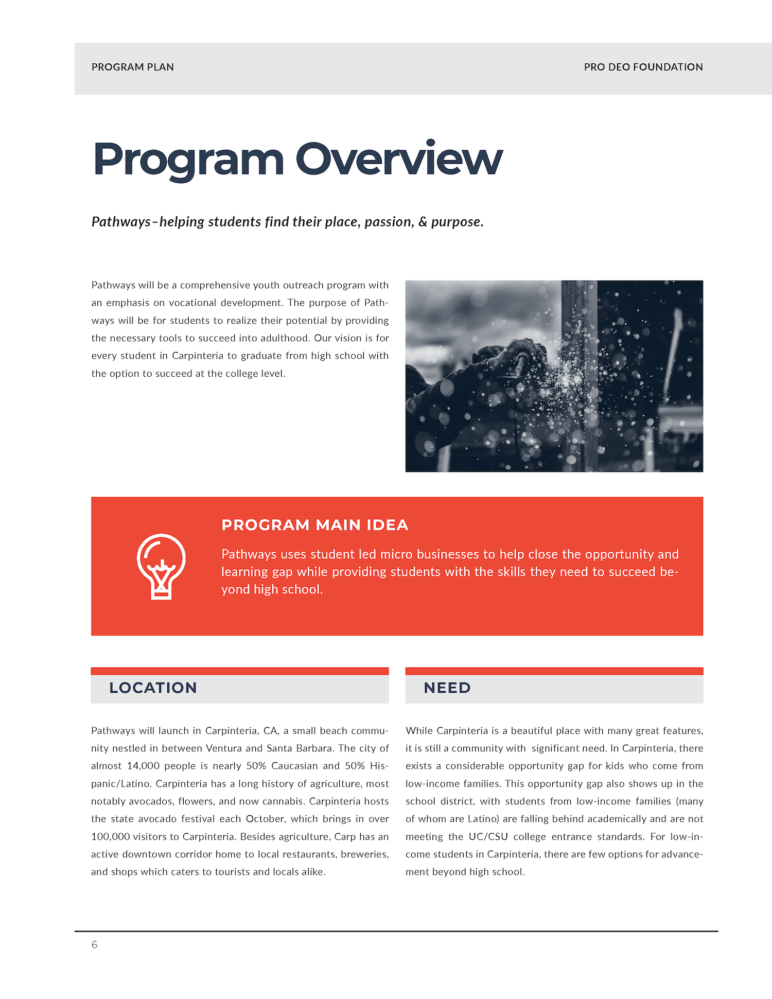
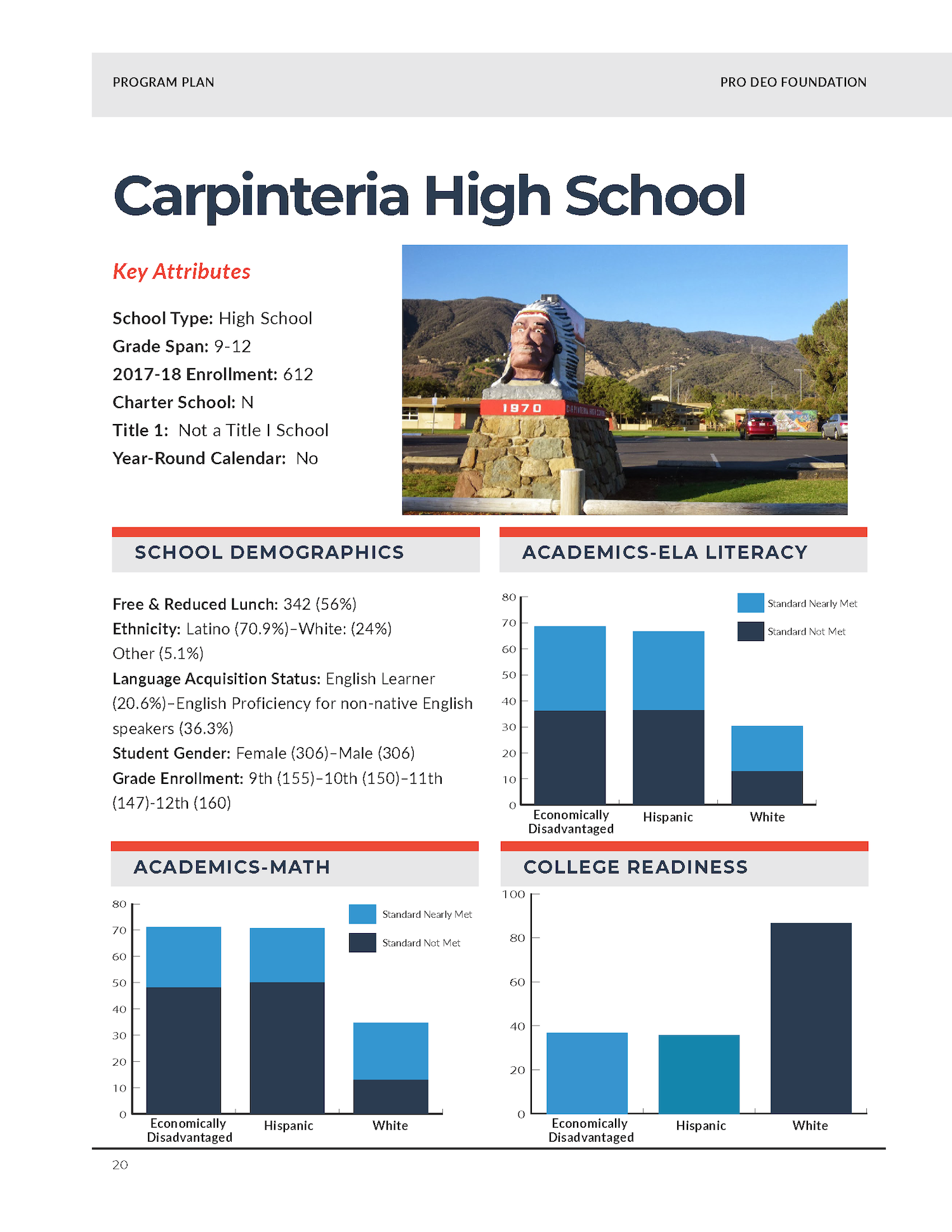
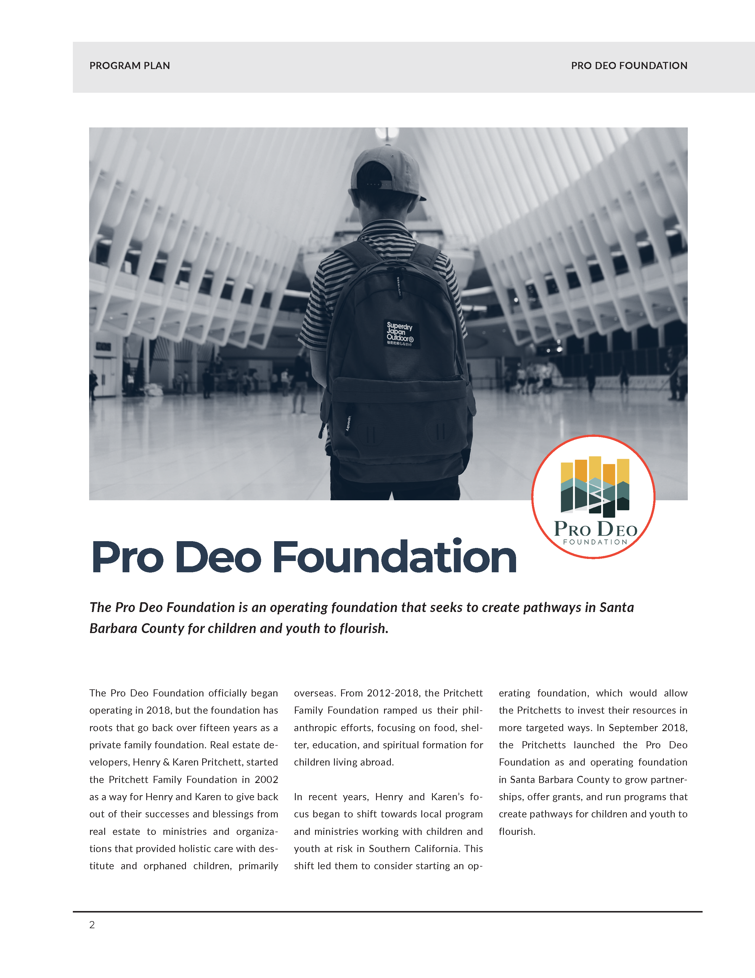
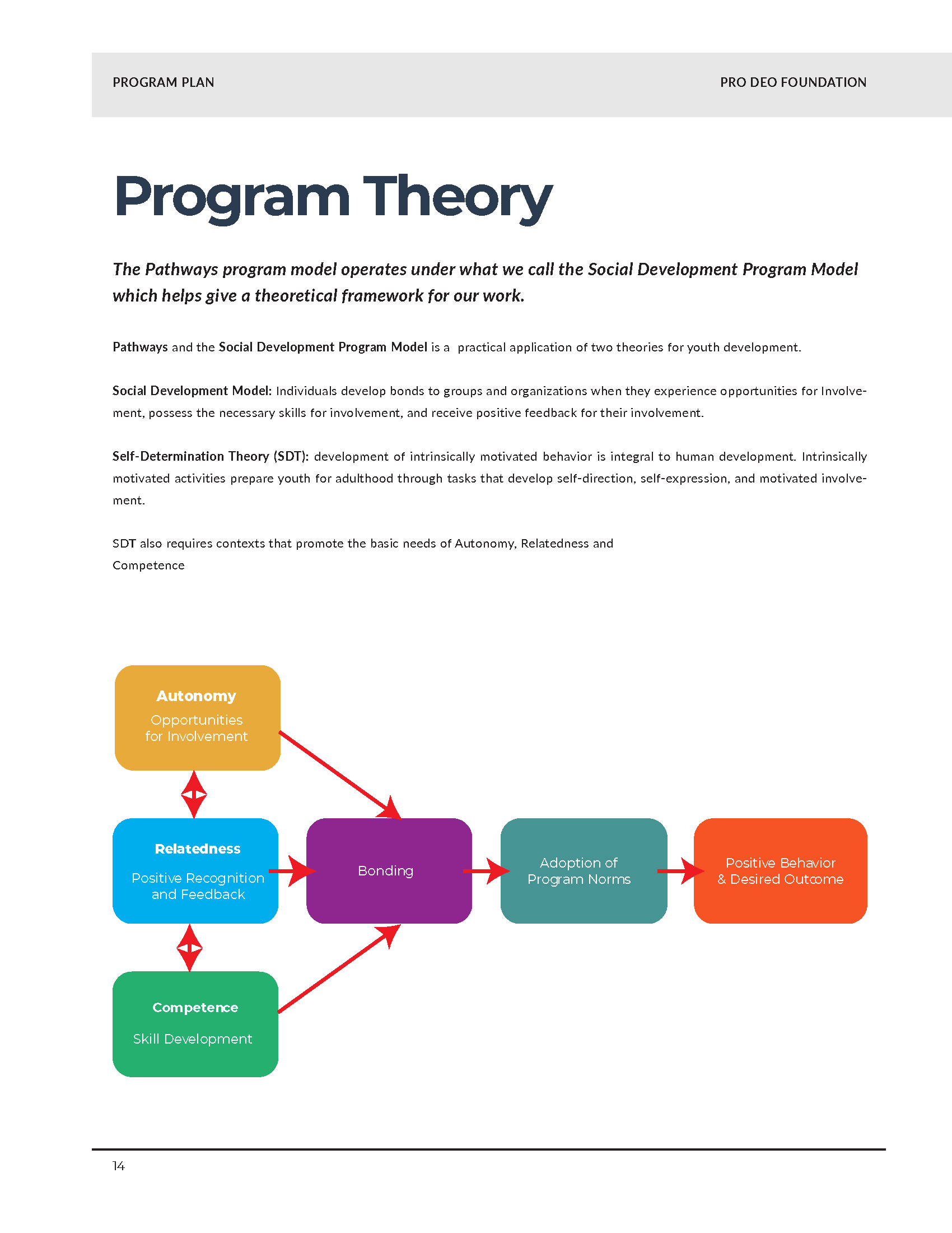
In creating this project, the Pro Deo Foundation had a visually stunning and effective communication piece we could use for prospective investors. I focused on strong visuals and a color story that complemented the written message. The result was a compelling
communication piece that effectively told the story of Pathways Carpinteria that our CEO could take into meetings with prospective supporters.
A New Online Presence for the Pro Deo Foundation
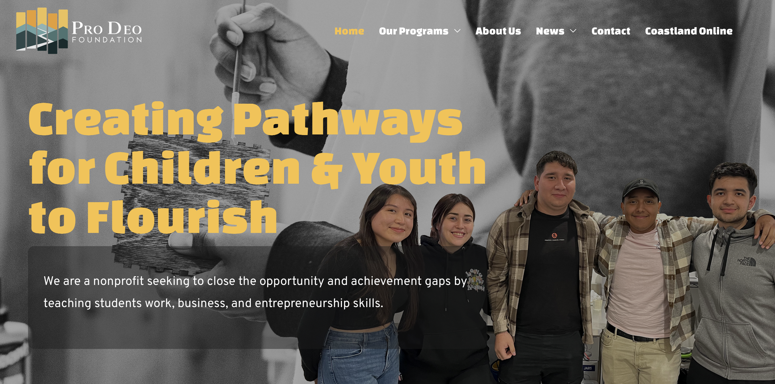
When the Pro Deo Foundation started in 2018, we had no programs or successes; we only had a mission and ideas. We knew we wanted to create programs that created “pathways for children and youth to flourish.” The first iteration of prodeofoundation.org was more aspirational than descriptive. As we began to run programs, we tried to adapt the website to reflect those changes.
After a few years with a piecemeal website, we knew that the time was right to create a new website from scratch. We needed a website that better reflected our programs and their successes. We needed something to share with potential donors to help create new supporters.
A Few Screenshots of the New Website
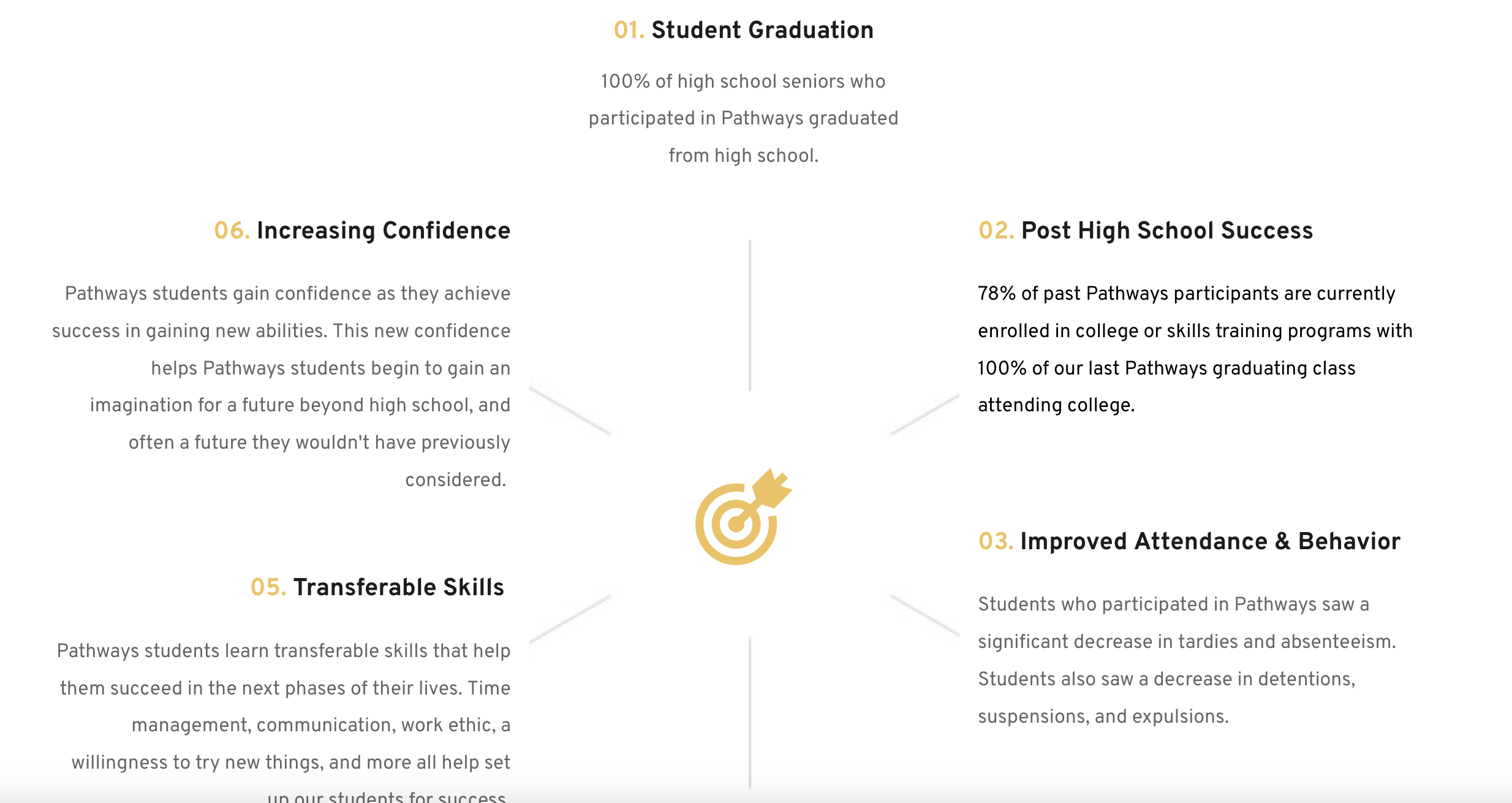
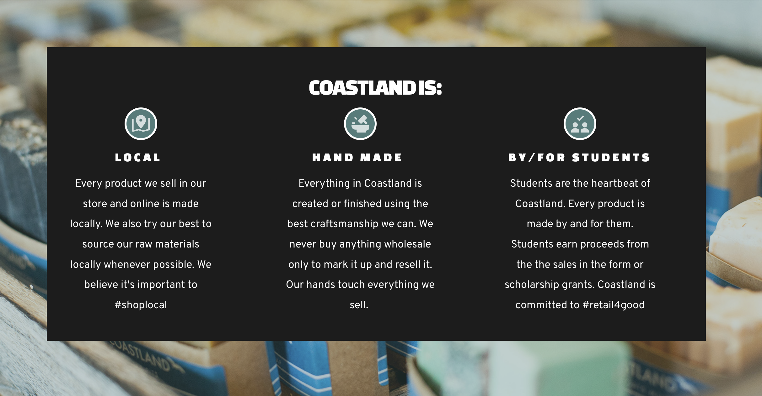
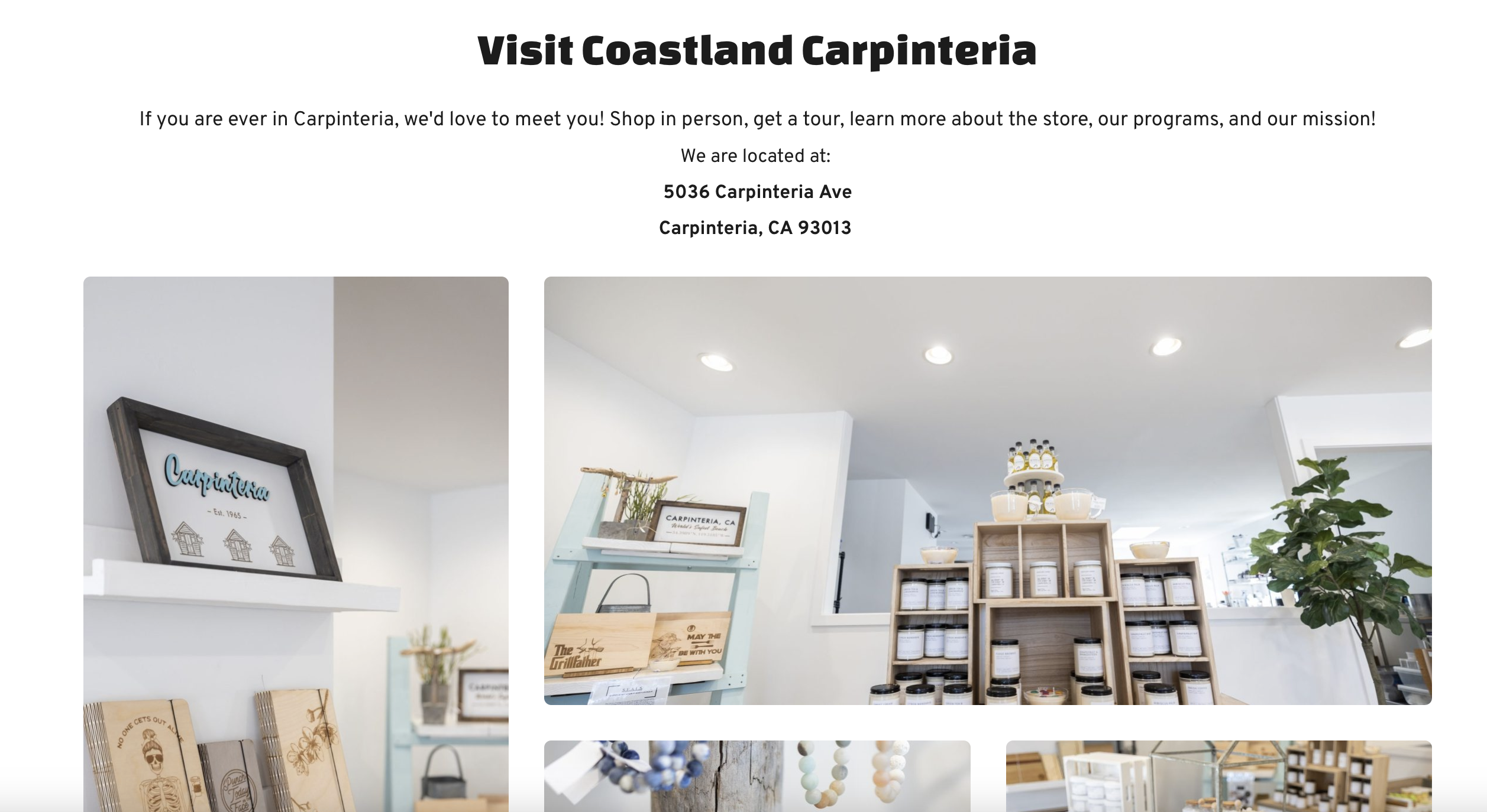
Structured Content to tell the Pro Deo Story
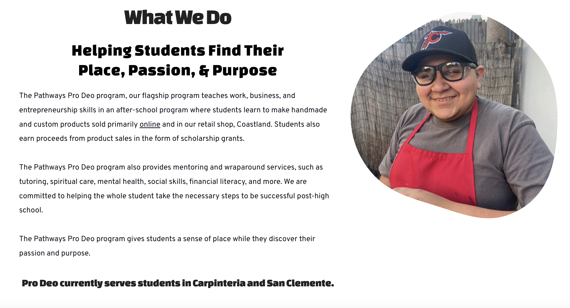
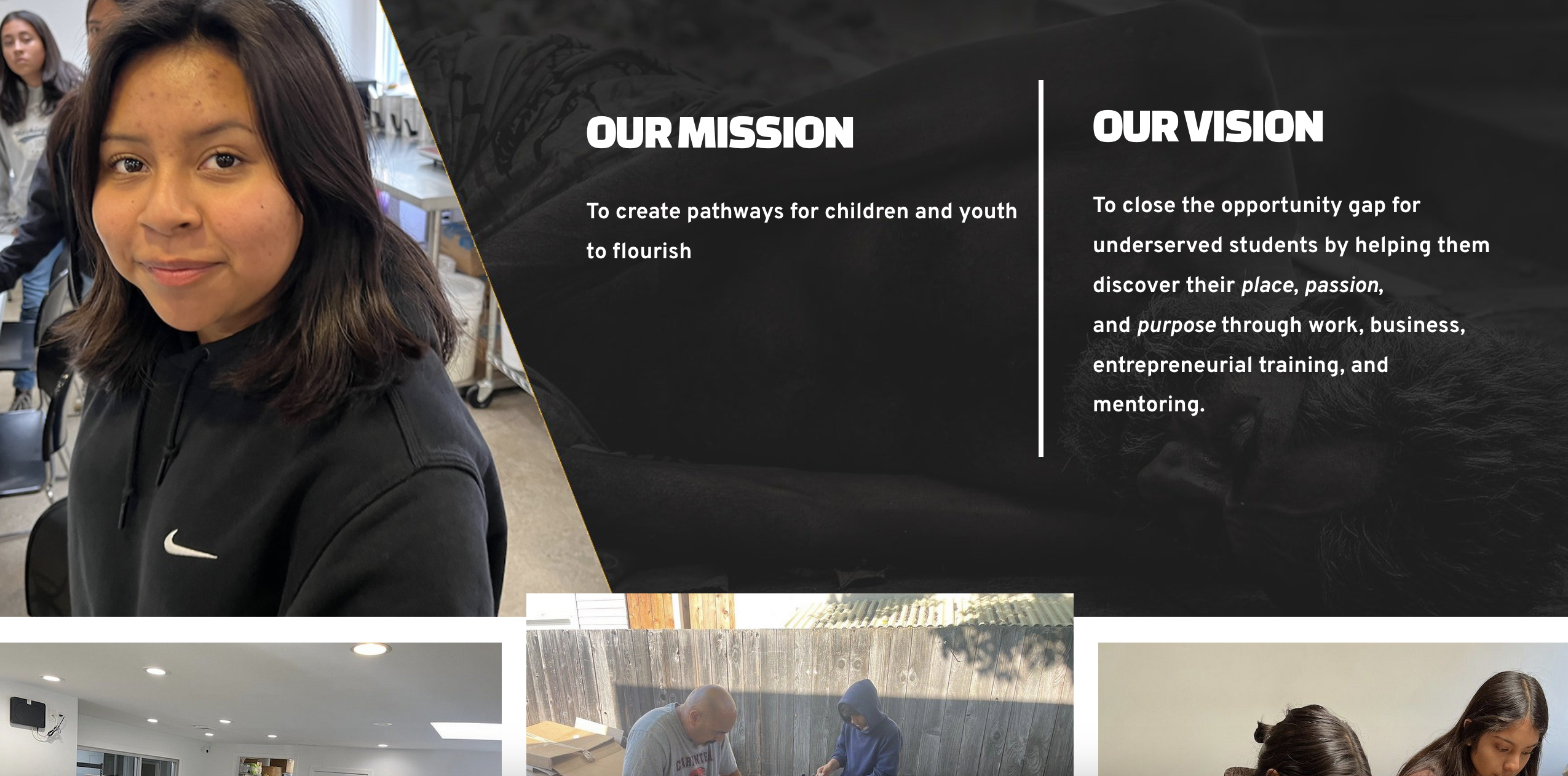
I wanted the new prodeofoundaton.org to be our main marketing piece. I needed the homepage to capture visitors’ attention and immediately compelled them to investigate the site further to learn about our mission and programs. I used large images, well structured content, and proof of concept quotes to help drive further engagement.
I chose Change One as the headline font for its youthful feel that was on brand with our youth programs. I chose Overpass for the body font as this font was easy to read and complimented the headline font. I also wanted to include various images of students participating in the program to help drive the message that our programs make a difference in students’ lives.
A Few Screenshots of the Website

Strategy for Engagement and Action
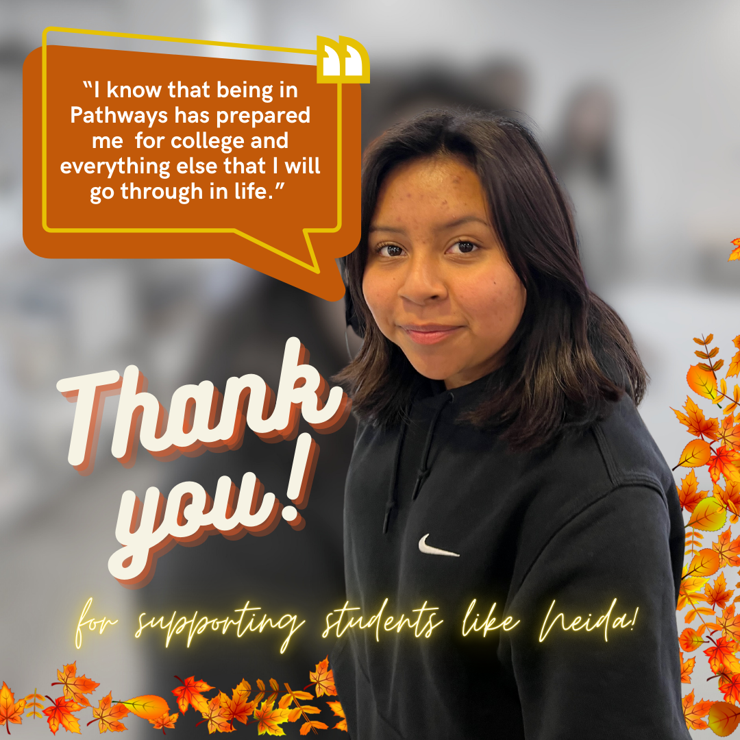
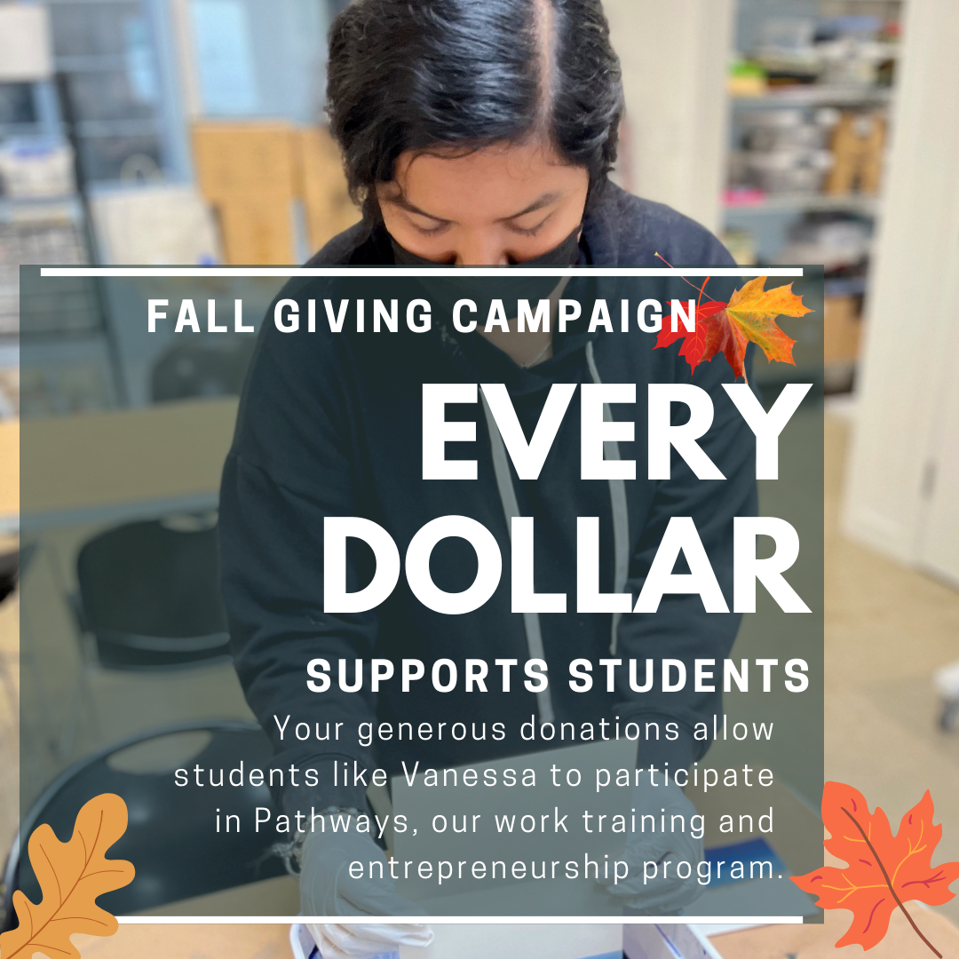
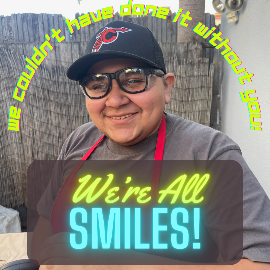
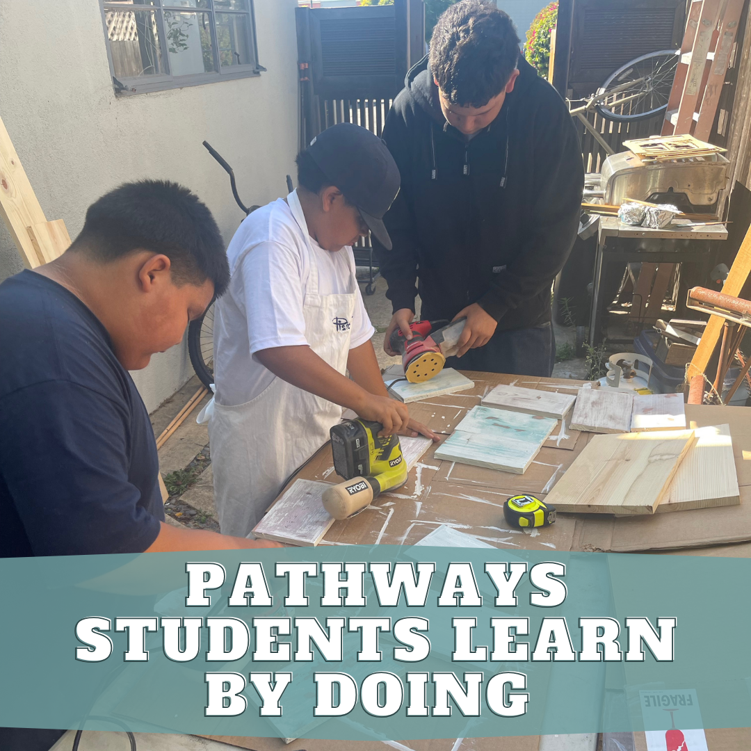
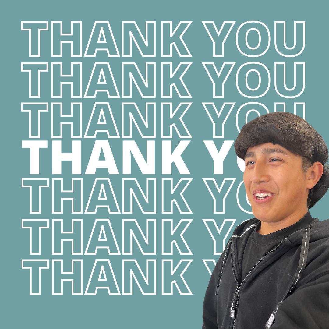
For the Fall Giving campaign, we focused on engagement and action, not just reach. That's why we prioritized Instagram, Facebook, and our email list. Instagram, with its visually-driven format, was perfect for showcasing heartwarming stories of our students and the impact of donor generosity. We tracked likes, shares, and comments and gauged resonance. On Facebook, we leveraged our existing community to drive donations directly through the platform. Our key metric there was link clicks to our donation page. We used our email list to send segmented emails to our most engaged supporters. We tracked link clicks and completed donations. By focusing on these targeted metrics and platforms, we ensured a successful Fall Giving campaign that inspired meaningful engagement, contributions and new donors.
Fall Giving Campaign
Through a unified campaign across social media and digital platforms, we amplified our message and secured new donors to support the work of the Pro Deo Foundation.
I launched our Fall Giving Campaign to amplify the message of our success as a foundation and to secure new donors. We were looking to expand our reach while expanding our digital giving platforms. We wanted strong messaging with compelling stories and images to drive our core messaging home.
For this campaign, we leveraged social media platforms, email lists, paid ads, a custom giving page, and timed messages to drive engagement. We successfully secured new donors, increased engagement, and built excitement for our
programs. Our Fall Giving campaign was a success and hit every key metric, which helped create momentum leading to the end of the year.
Vision 2020
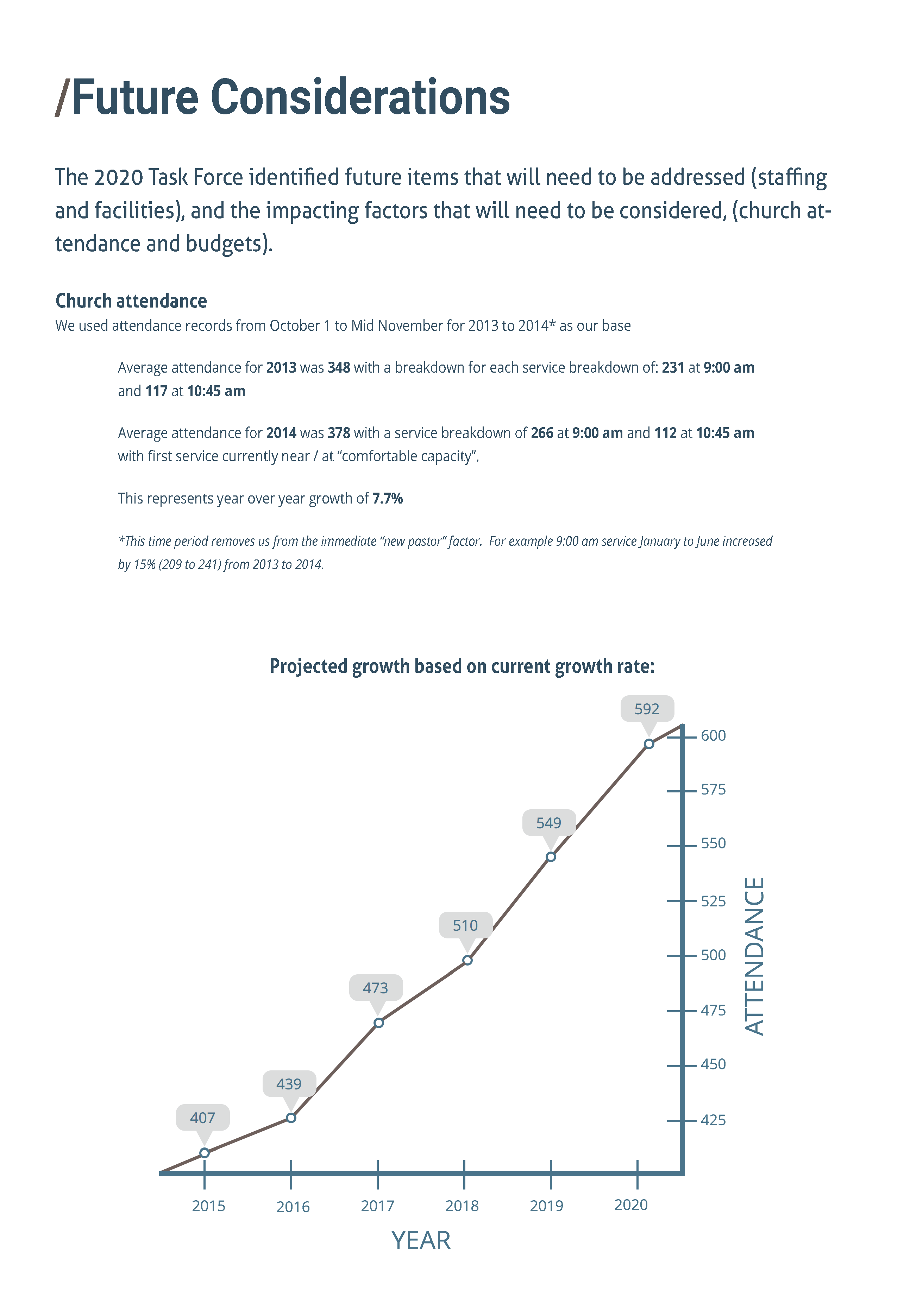
On the verge of 50 years as a congregation in the Seattle area, John Knox Church set out to create a new 3 to 5-year vision that would be a
rallying point for all organizational departments and congregants. The Vision 2020 team sought ways to communicate the new vision, objectives,
and outcomes. A primary goal was to achieve high buy-in and excitement leading to the 50th-year celebrations.
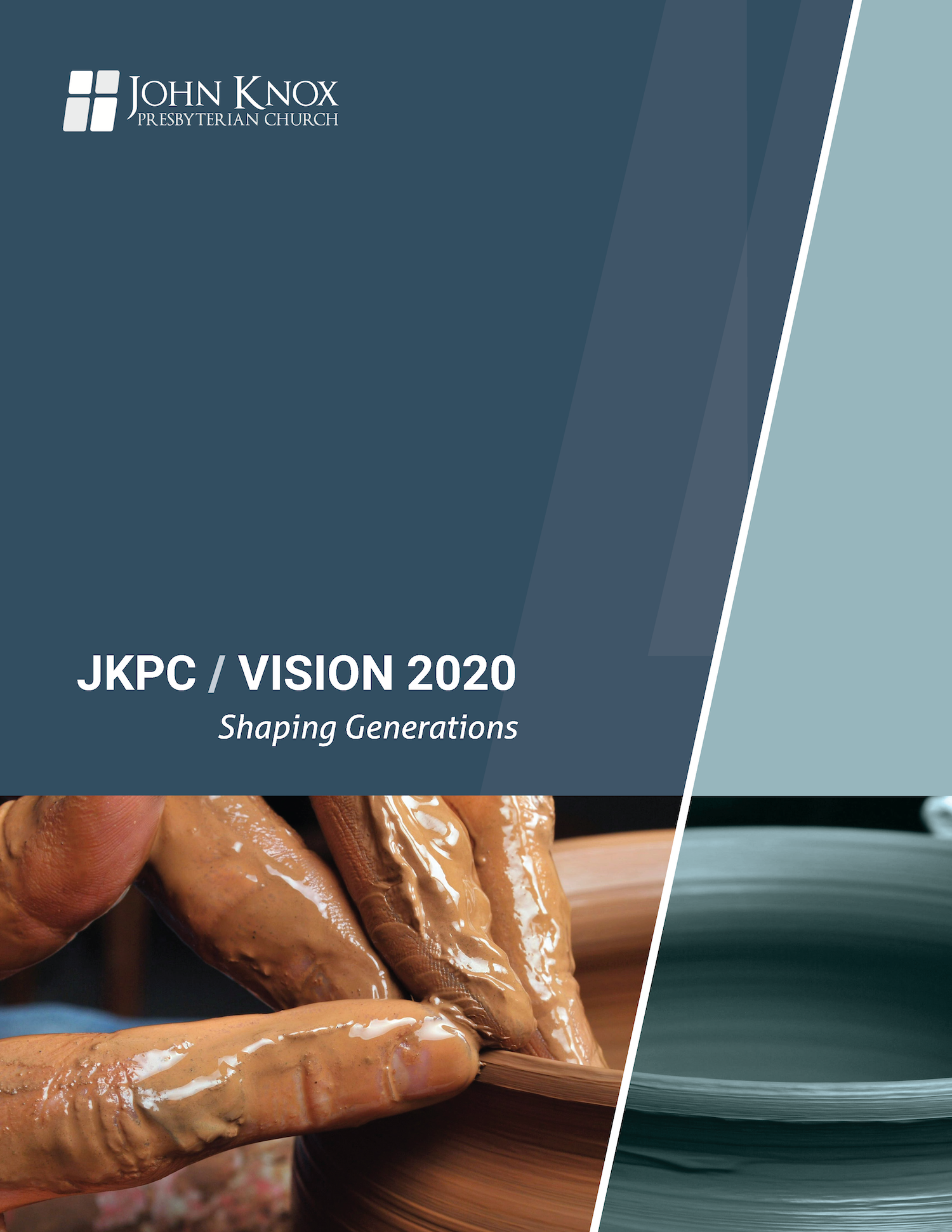
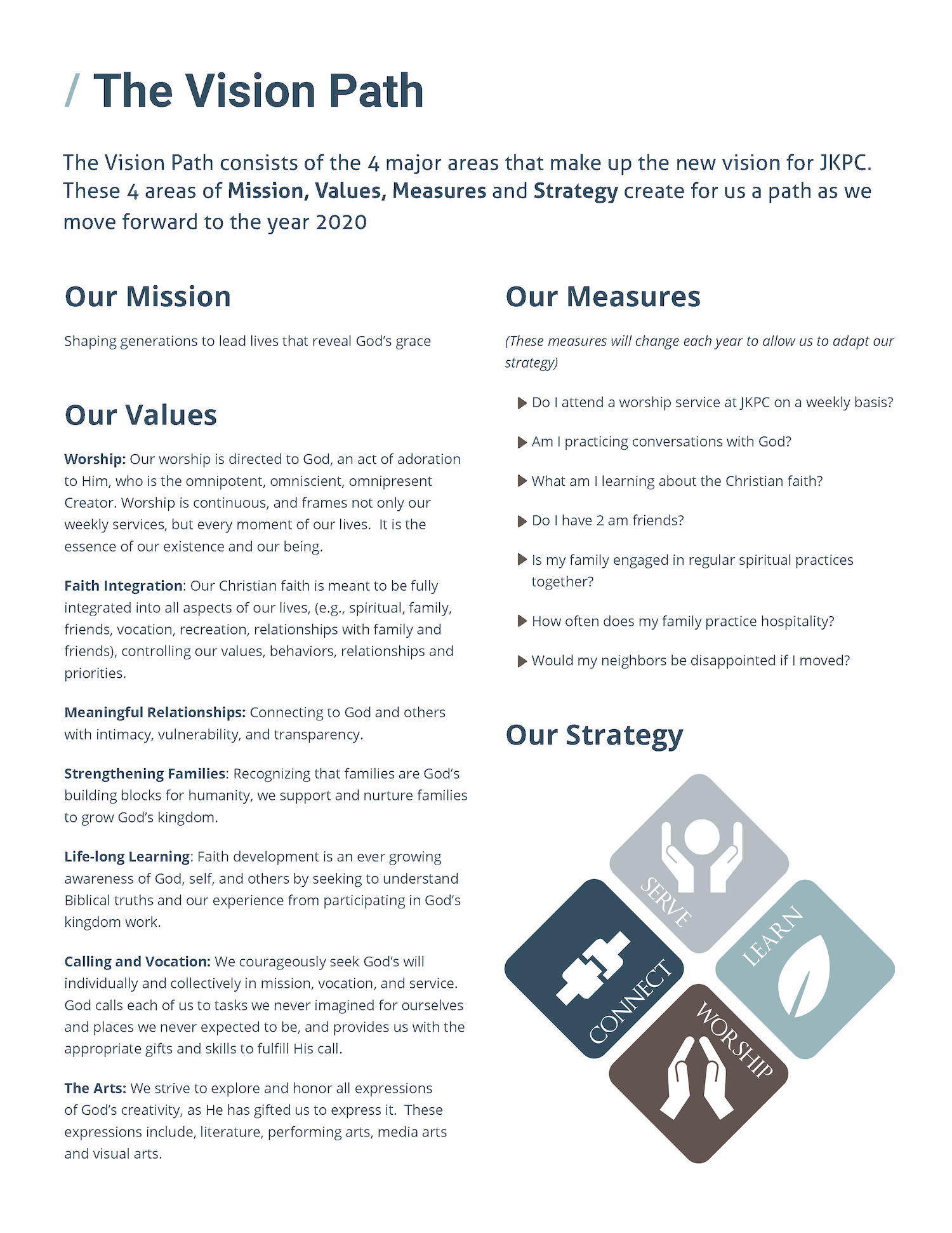
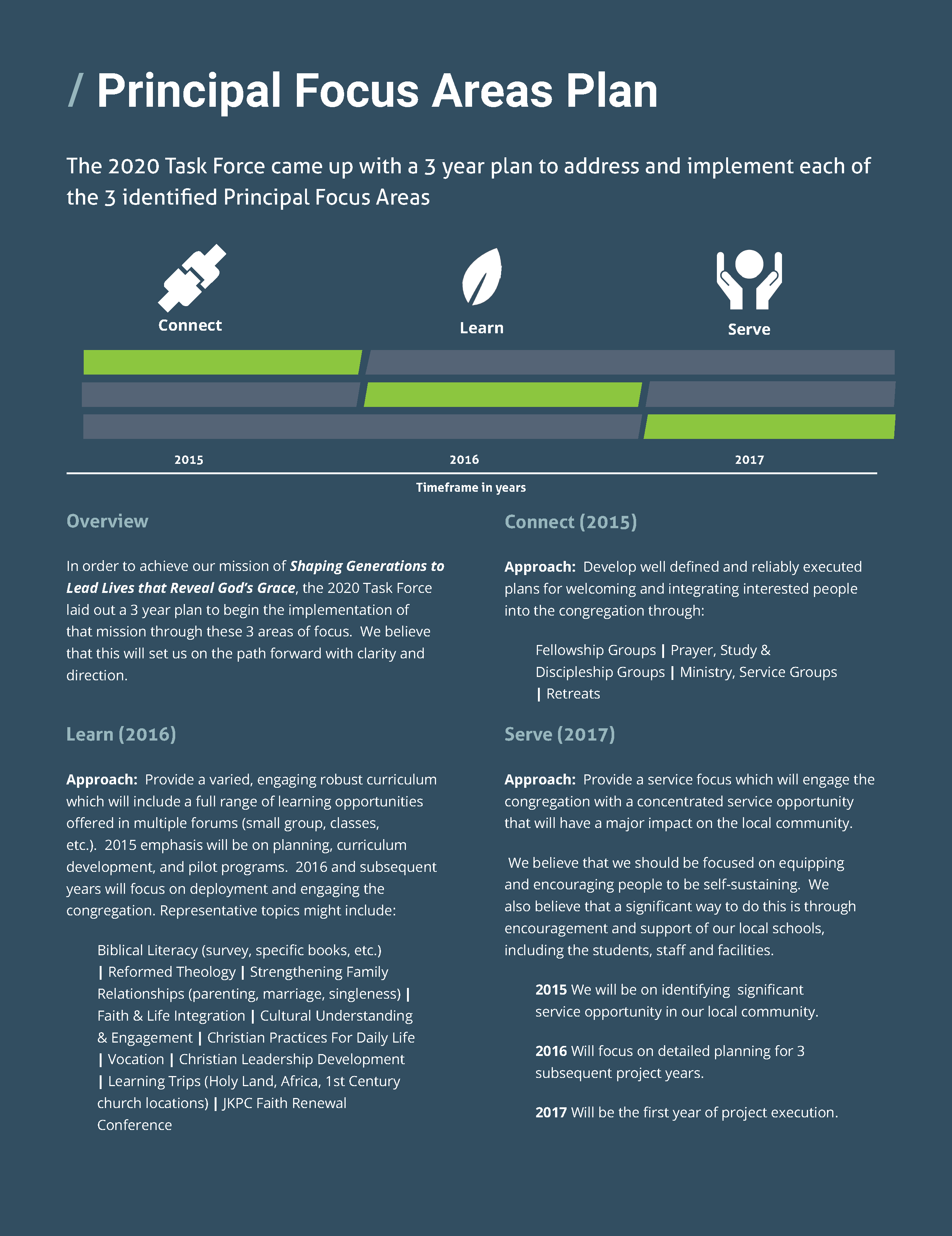
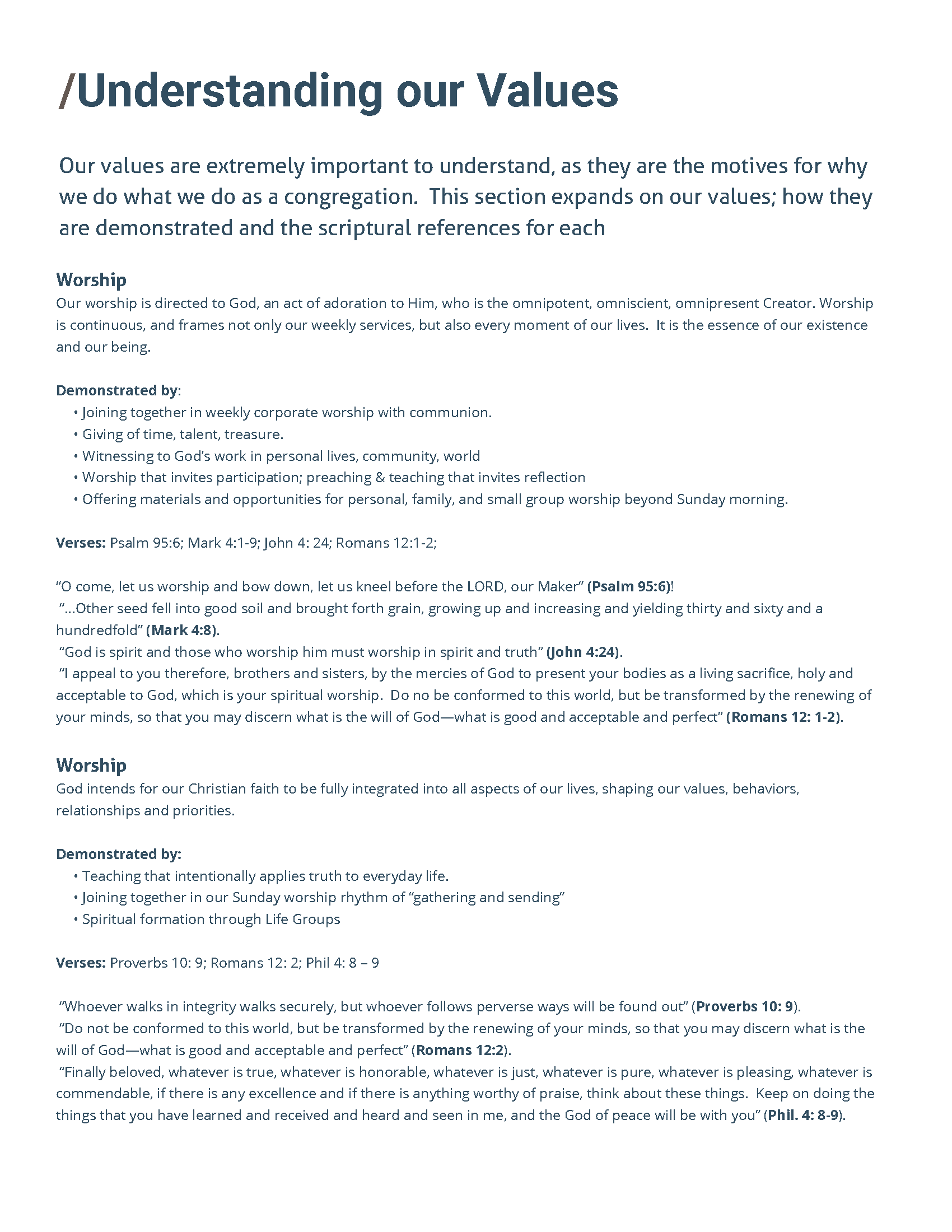
Working with the Vision 2020 leadership team, we collaborated to create an eye-catching booklet with structured content that was easy to read and understand.
The Vision 2020 booklet needed to communicate the extensive content and work the Vision 2020 leadership team had done leading up to the launch, and the challenge was how to structure and present the content in easy-to-read and understandable ways. If the reader were inundated with text and confusing technical language, buy-in would be much more
challenging. A strong understanding of page layout and design was needed to achieve the final results.
New branding and color story
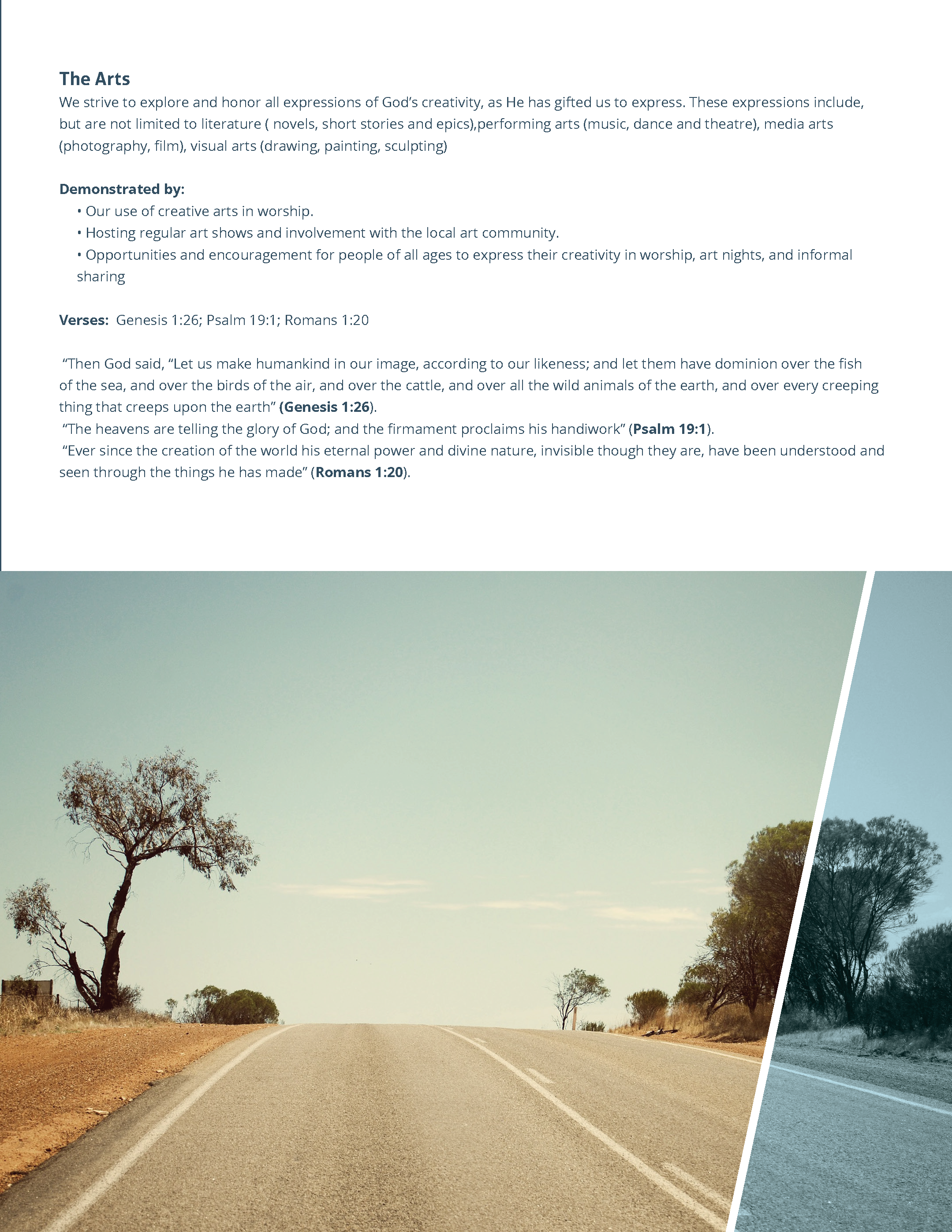
We also used the Vision 2020 launch to rebrand the church with a new updated logo and style guides, including a new color story. The old branding was old and outdated and was not in line with the new vision and direction the church was heading. We chose a new color palette that gave John Knox Church a fresh and modern feel without sacrificing the
years of history that preceded Vision 2020.
Before the launch of Vision 2020, the church struggled with unified typography in its publications and communications. This leads to disjointed and often difficult-to-read materials. The new style guides included a new font stack and typography rules. The new typography was chosen to be modern, clean, and easy to read. The headline font
complements the paragraph fonts, creating easy-to-read typography.
A election of Booklet Vision 2020 Booklet Pages
2022 Year In Review
Sharing the stories and success of the Pro Deo Foundation
2022 was a big year for the Pro Deo Foundation. The foundation had just finished its fourth year of running its business and entrepreneurship
training program for local students. In 2022, we entered into a season of growth and change, and we wanted to highlight that growth with a new website that highlighted that growth and shared the stories of Pro Deo from 2022.
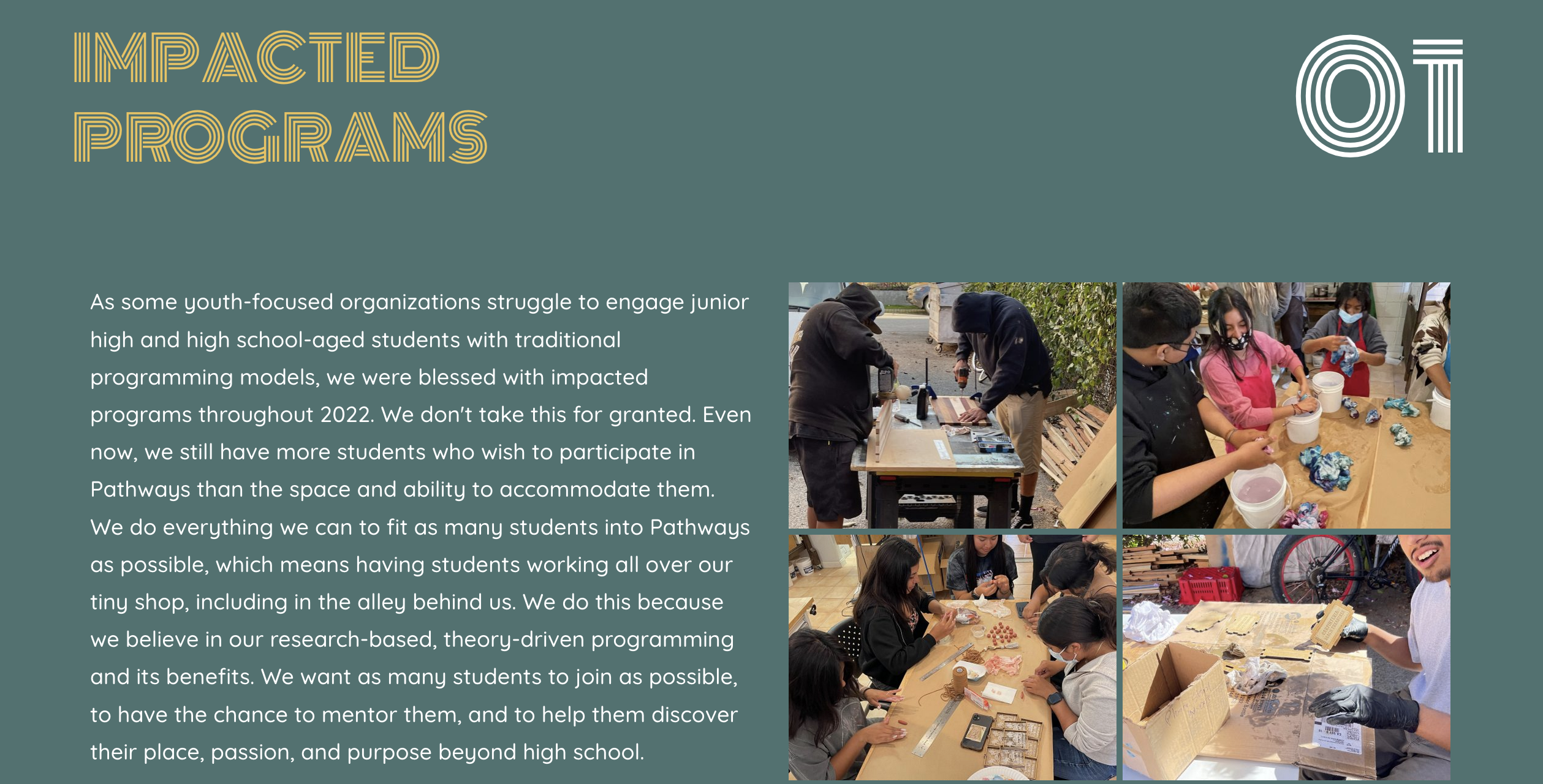
We wanted a simple website that was easy to navigate. The website also needed to be a mix of text with images, and those images needed to
support the text to help drive home the stories being told. Ultimately, the website delivered and helped reinforce Pro Deo as a leader in youth
programming on the Central Coast.
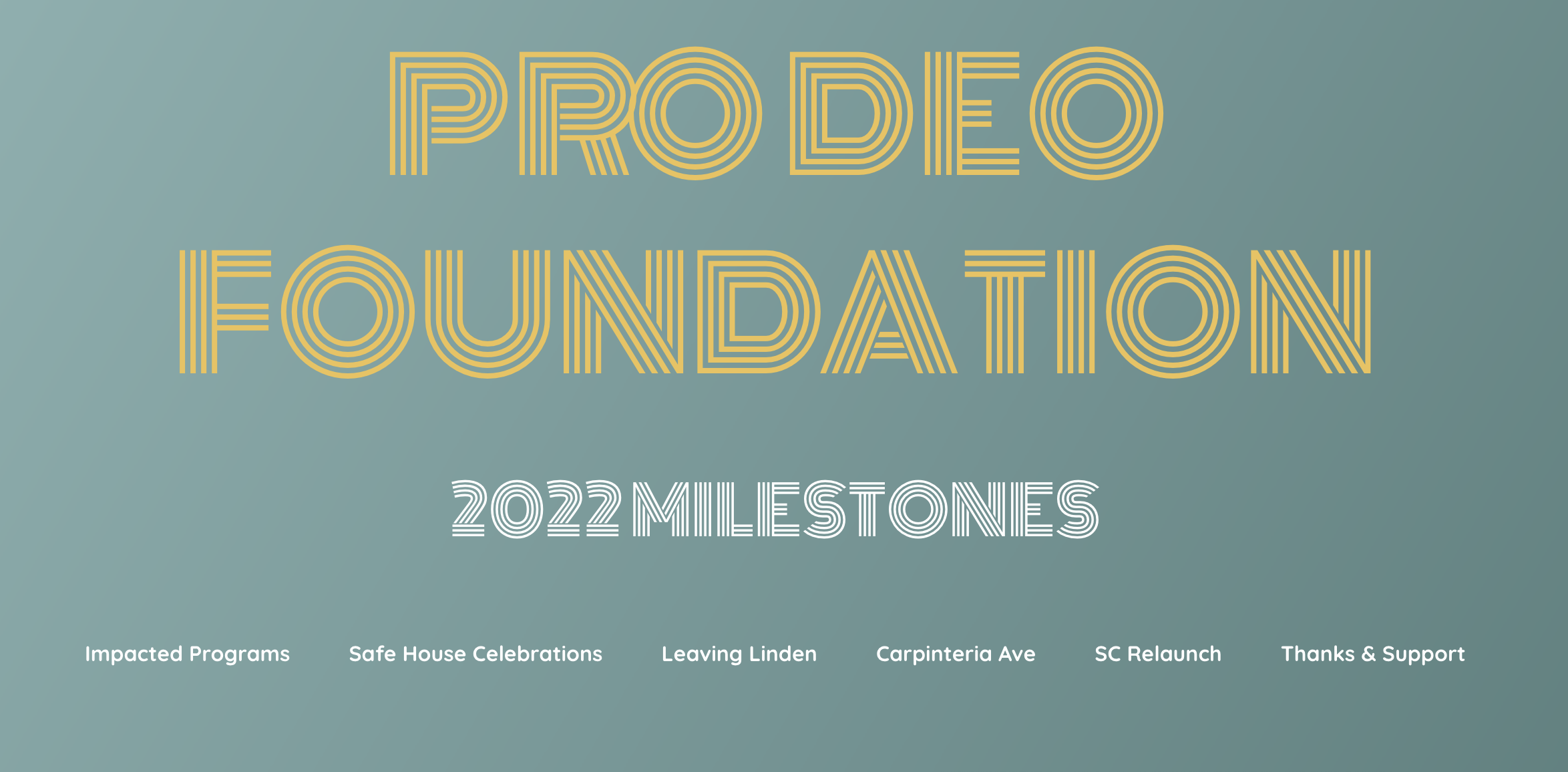
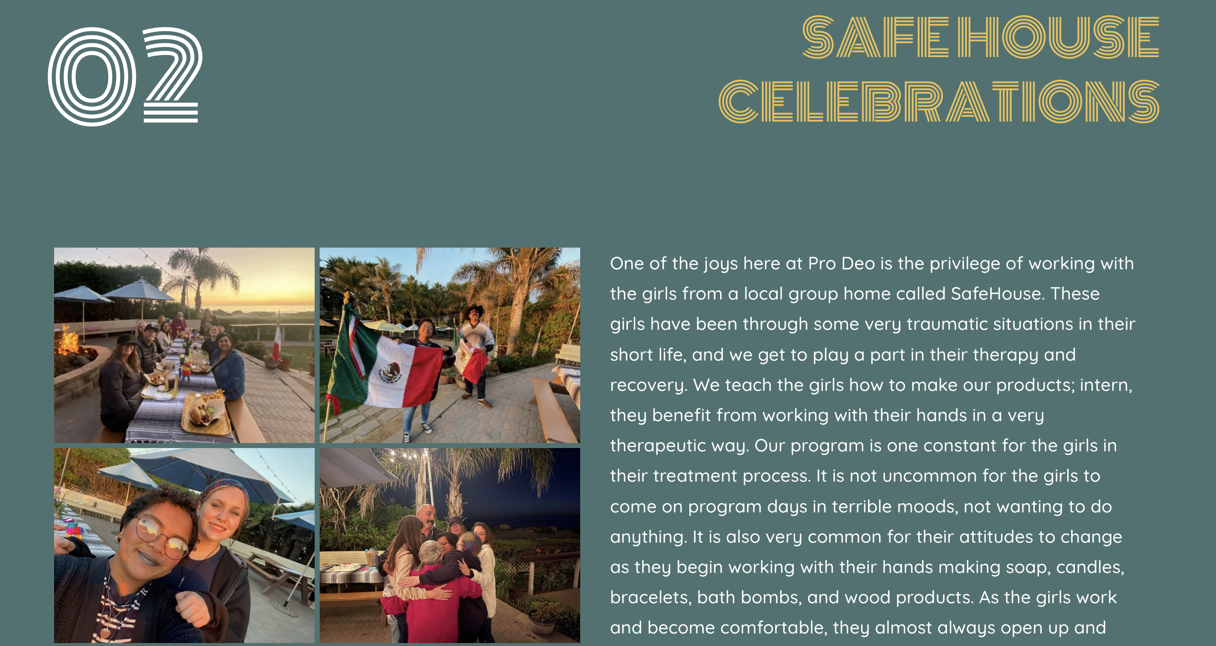
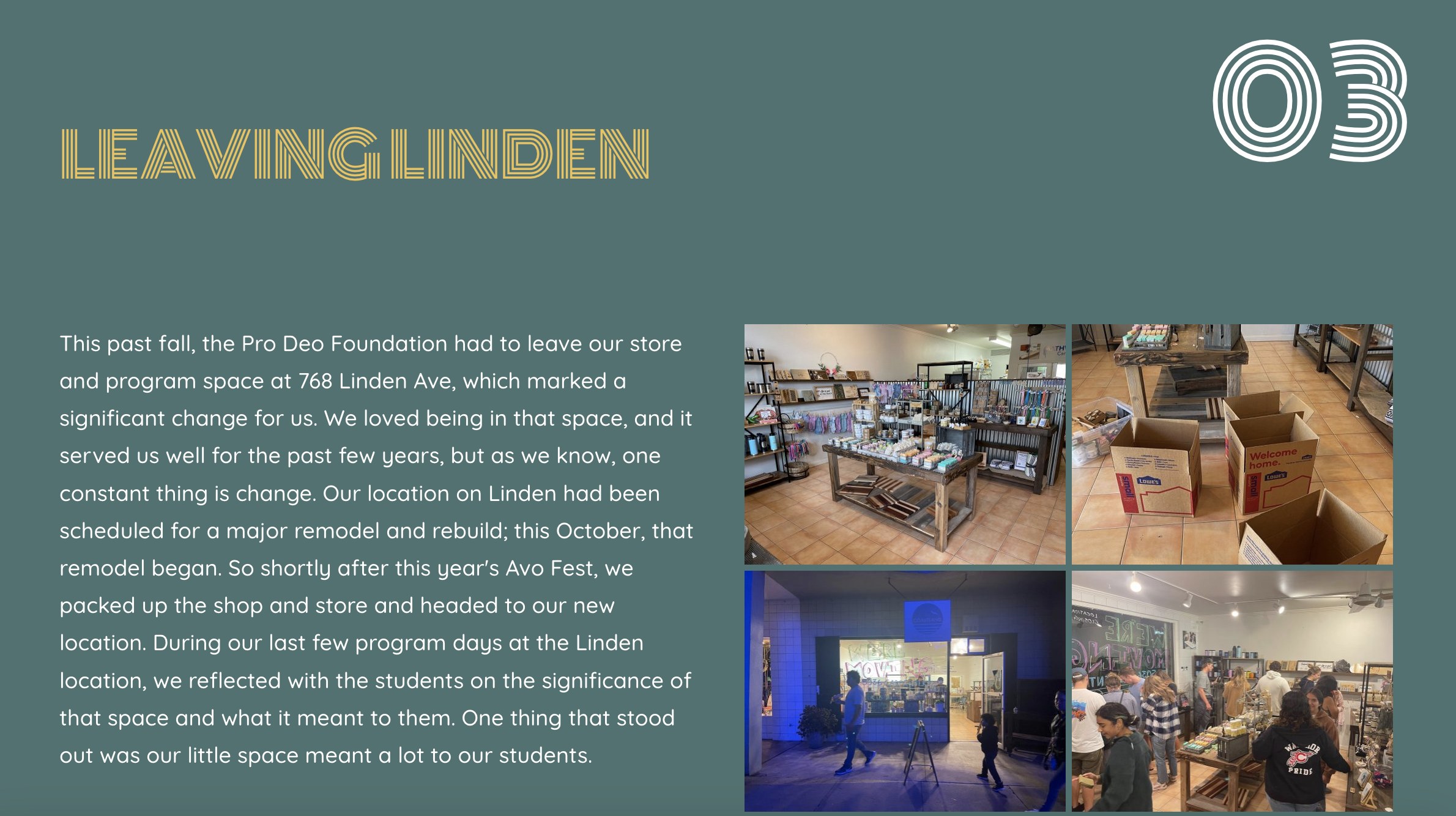
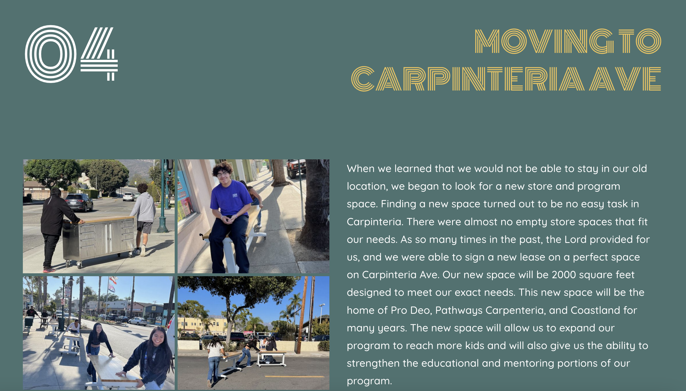
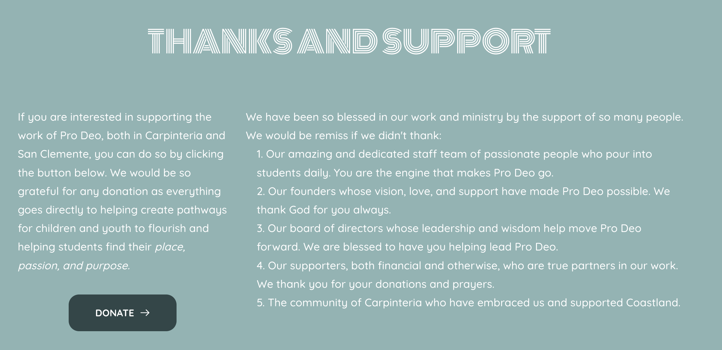
A Few Screenshots of the Year in Review Website
Structured Branding with Some Deviation
I wanted the 2022 year in review site to retain the strong color story of Pro Deo but I also wanted to deviate from the organizational font stack to something a bit more youthful and fun. Something that still had ties to the Pro Deo branding, but was more in line with the population we served.
I chose Monoton for our headline font. I thought it gave the headlines on the website a youthful and fun vibe while retaining readability. I decided on Quicksand, a modern sans-serif font with excellent paragraph readability. I chose the galleries to complement the text and help tell the story. I also gave the text blocks a zig-zag pattern for a modern feel.
